Customers are inundated with surveys.
We get them on receipts, via email, and in the mail. Shop somewhere and you're asked to take a survey. Don't shop somewhere, and a survey still appears. Visit a website and ping!, you get asked to take a survey.
I decided to take a week and do a small experiment. During that week, I would take every single survey I was asked to complete. The idea was to test three things:
How many surveys would I be offered?
Were any of the surveys well-designed?
What was the experience like?
I was asked to complete 10 surveys during the week. That pencils out to over 500 surveys per year! No wonder customers experience survey fatigue.
Only one of the 10 surveys was well-designed. Every other survey had at least one glaring flaw, and most had multiple failures. More on that in a moment.
And what was my experience like? Most of the surveys backfired. The experience was so poor it made me like the company even less.
Surveys Are Too Difficult
When you ask a customer to take a survey, you're really asking the customer to do you a favor. A lot of the surveys I took made that favor really difficult.
Just accessing the surveys was a big challenge.
My first survey request was on a receipt from the post office. The receipt had a QR code that I was able to quickly scan with my phone, but then the survey site itself was not optimized for mobile phones.
A survey from Dropbox wanted me to first read and acknowledge a confidentiality agreement before completing its survey.
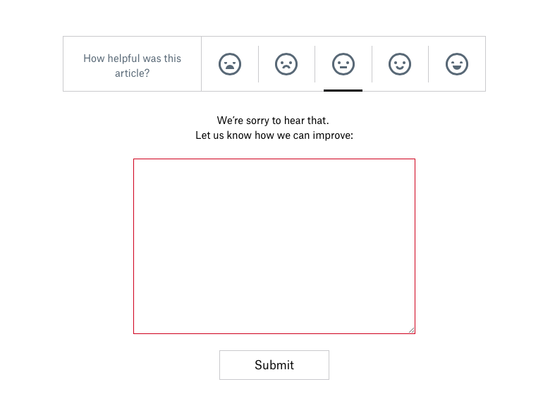
The super odd thing was the confidentiality agreement had it's own survey! This extra bit of aggravation got even more annoying when the survey required me to fill out the comments box to explain my rating of the confidentiality agreement.
Back to the first Dropbox survey, I had been working on it for 11 minutes in when I hit an infinite loop. None of the answers to a question applied to me, and it lacked a “Not Applicable” option for this required question. I felt I had put in enough time at that point and just gave up.
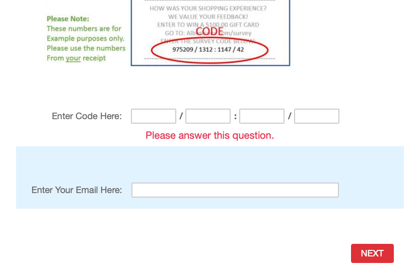
The survey invitation from Vons, my local grocery store, was a real piece of work. It was a receipt invitation, but there was no QR code, so I had to manually enter the web address. Then I had to enter a string of numbers along with my email address!
I couldn't complete two surveys due to errors. An email invitation from Chewy linked to a web page that I couldn't get to load. The Human Resources Certification Institute sent me a survey on May 24 that closed on May 23. Completing that survey is pretty low on the list of things I would do if I had access to a time machine.
Poor Survey Design
Beyond being difficult, just one of the ten surveys was designed well enough to provide useful, actionable, and unbiased information.
Many surveys were too long, which often triggers low completion rates. The Dropbox survey advertised it would take 15 minutes. (Who has that kind of time?!) These companies' surveys could easily be redesigned to get better data and higher completion rates from just three questions.
Many were full of leading questions designed to boost scores. This AutoZone survey arranged the rating scale with the positive response first, which is a subtle way to boost ratings. Like many of the surveys I took, there wasn't an option to leave comments and explain why I gave the ratings I did.
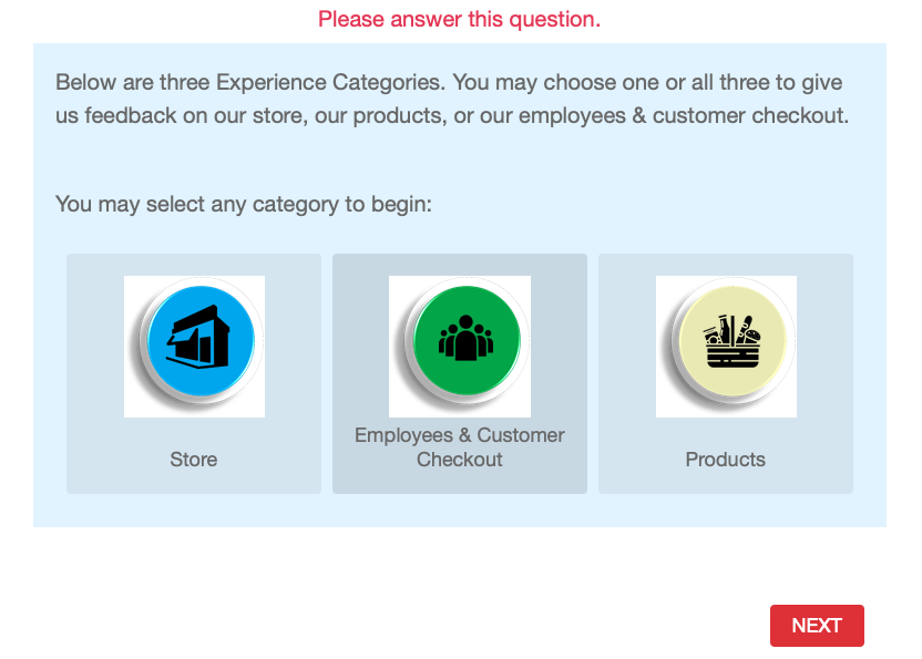
The survey from Vons was an odd choose your own adventure survey, where I got to decide which topic(s) I wanted to be surveyed on.
This created unnecessary friction and generated a little confusion since my biggest gripe on that particular visit was the large number of aisles blocked off by people stocking shelves. Is that a store issue, an employee issue, or a product issue? It’s a great example of where asking a customer to simply give a rating and then explain the rating would quickly get to the core of my dissatisfaction.
The One Good Example
The best survey was a Net Promoter Score (NPS) survey from Suunto.
I received this survey invitation about six months after I registered a new watch on the Suunto website. NPS surveys measure a customer's intent to recommend, so giving me six months to use the watch before asking if I'd recommend it allows enough time for me to know what I like and don't like about the product.
Another positive was it asked just two questions: a rating and a comment.
Short surveys tend to have much higher completion rates than longer ones. Counterintuitively, you can almost always get more useful data from a short survey than a long and tedious survey. (More on that here.)
My question about the Suunto survey was whether the survey was linked to my contact information. This is necessary so someone from Suunto can follow-up with unhappy customers to learn more about the issues they're experiencing. (More on that here.)
Resources to Create Better Surveys
Here are some resources to help you avoid these mistakes and create better surveys.
Check out this survey resource page
Explore some survey alternatives
Watch this webinar on ways to easily analyze survey comments
You can also get step-by-step instructions for creating a great survey program by taking my customer service survey course on LinkedIn Learning.


